Lien Hoa Van Bao — Bringing Tibetan In-Store Atmosphere Online
Overview
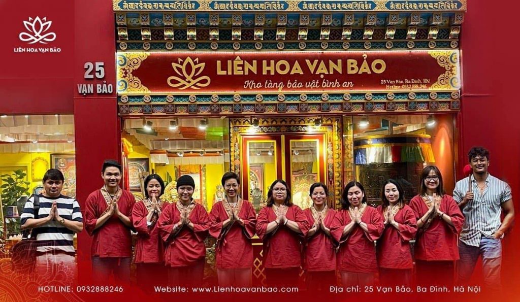
Lien Hoa Van Bao is one of Vietnam’s leading Tibetan Buddhist spiritual product stores in the North of Vietnam. The physical store carried a strong emotional atmosphere, but the previous digital experience did not fully communicate that same depth.
Our objective was to build a website that preserves spiritual identity while improving product discoverability, trust, and repeat engagement.
Problems
Translating a Physical Atmosphere Into Digital Form
The in-store experience relies on mood, symbolism, and careful curation. Recreating that spiritual authority online without losing commercial usability was the core design challenge.
Highly Diverse Product Catalogue With No Unified System
Bracelets, Dzi stones, Thangka paintings, statues, and mandala items each carry different visual weight and browsing behavior. One card layout cannot do justice to all of them.
Building Trust From Zero Digital Presence
With no prior website history, building immediate credibility required structured testimonials, real video evidence, and frictionless contact flows from launch.
Creating Long-Term Engagement, Not Just a Storefront
The site needed a compelling reason for visitors to return beyond direct purchase intent — something that reinforces the brand’s spiritual character over time.
Process
The implementation combined trust-first design strategy with an operational system that supports fast campaign relaunches.
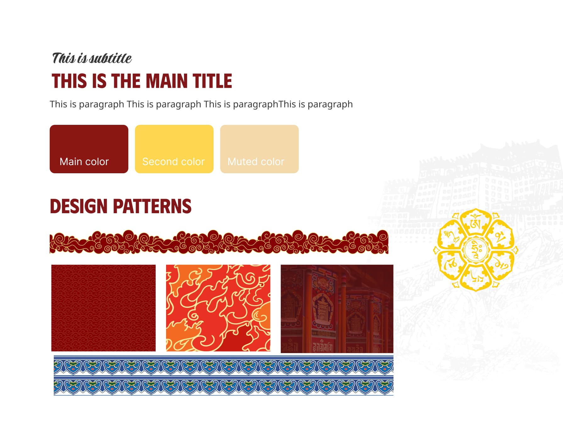
Standardizing Tibetan Visual Language
Color hierarchy, symbolic motifs, and composition principles were standardized across templates so the website could feel spiritually coherent while remaining flexible for commerce.
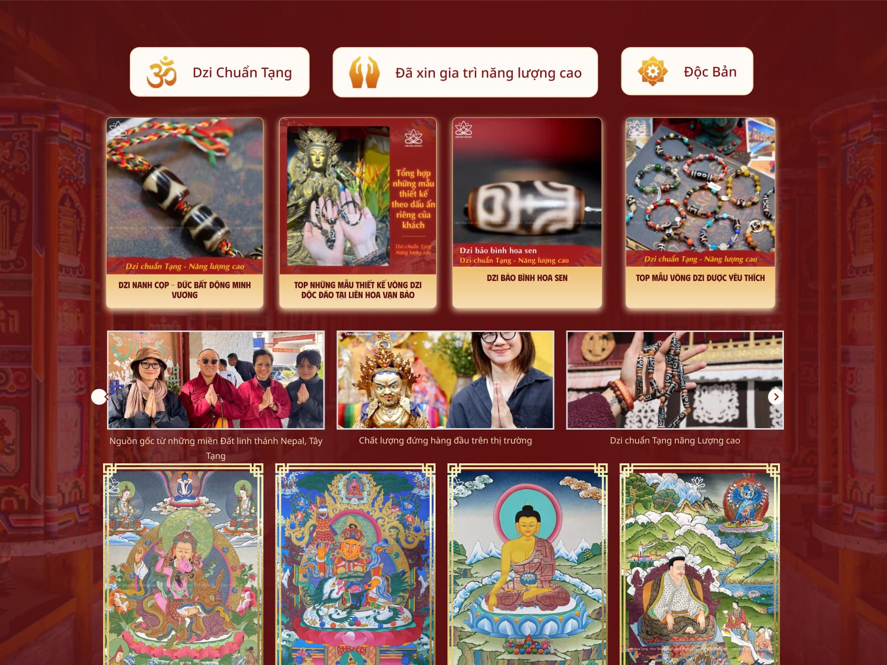
Designing by Product Behavior, Not One Template
We assigned card and composition styles by category: faster-comparison layouts for utility products and depth-oriented layouts for sacred art objects, improving scanability and reducing cognitive load.
Combining Proof, Content, and Signature Interaction
We added filtered feedback architecture, expanded video trust content, and a custom 3D “Wisdom Message” draw flow to support repeat engagement beyond direct purchase intent.
Design Highlights
The final system balances spiritual tone, product clarity, and operational scalability in one cohesive platform.
Spiritual Tone with Controlled Motion
GSAP motion patterns were intentionally restrained—gentle reveals, symbolic rotation, and calm transitions that support atmosphere without visual noise.
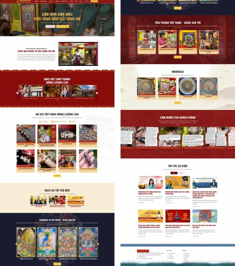
Category-Based Product Presentation
Slider modules were used intentionally to present dense content without visual fatigue while keeping scroll depth manageable.
Authentic Visual Production Pipeline
Each product group uses an appropriate visual rhythm, preserving category personality while maintaining brand consistency.
Filtered Feedback and Video Trust Blocks
Testimonials and video evidence were structured for better credibility scanning and easier ongoing content curation.
3D Wisdom Message Interaction
A custom card-draw experience introduces a recurring reason to return, helping the site function as a community touchpoint, not only a storefront.